
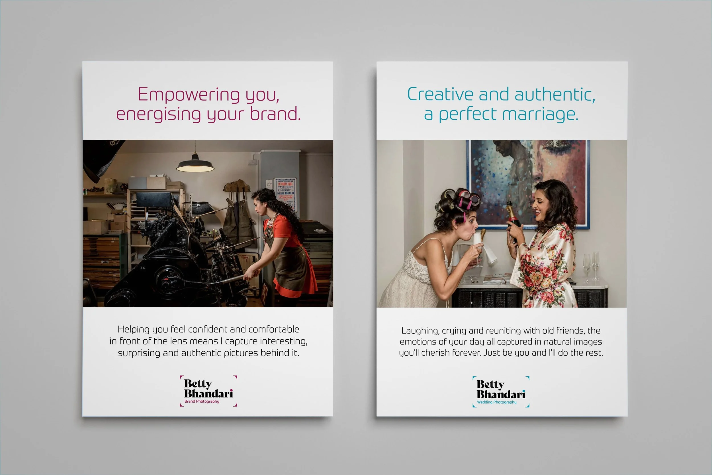
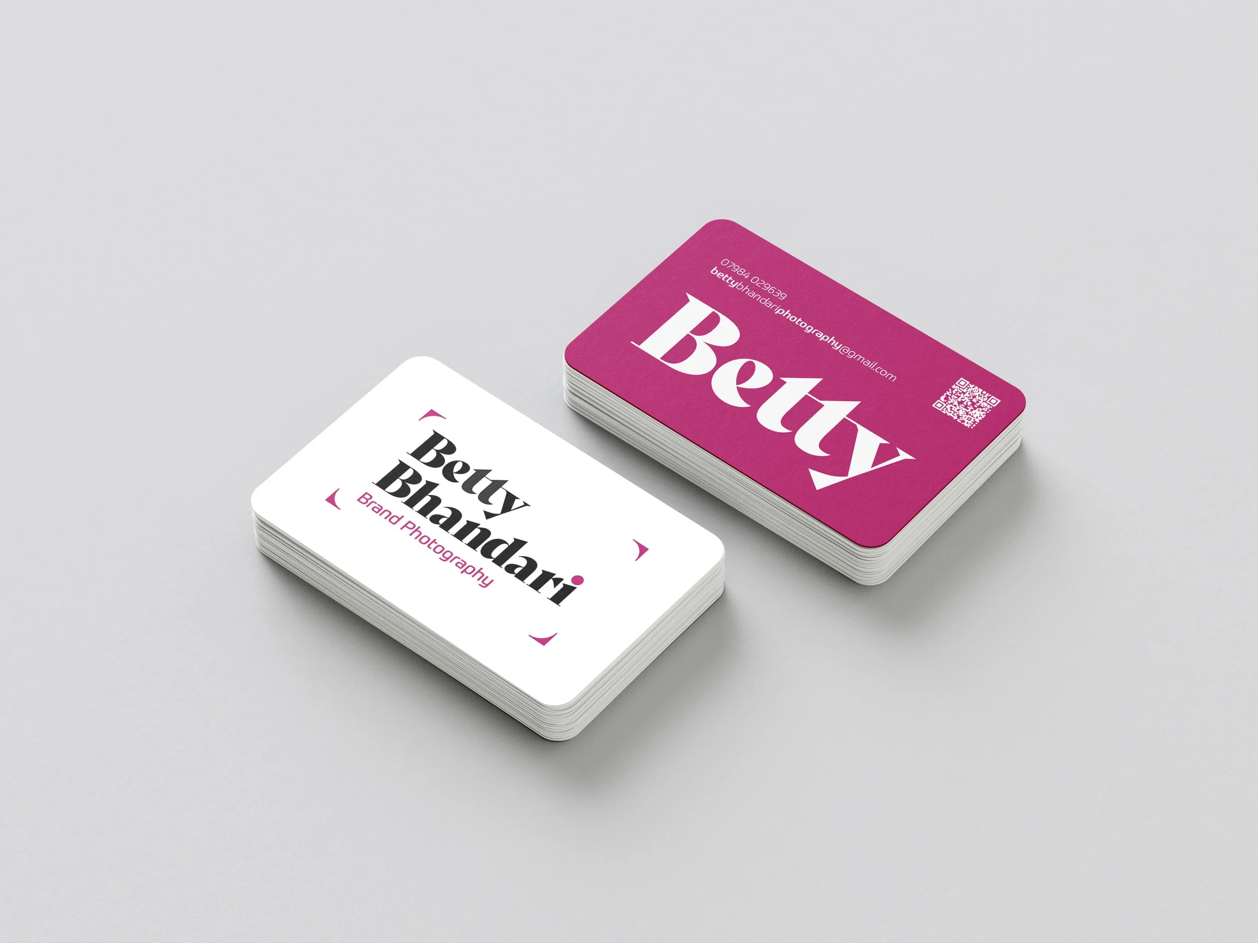


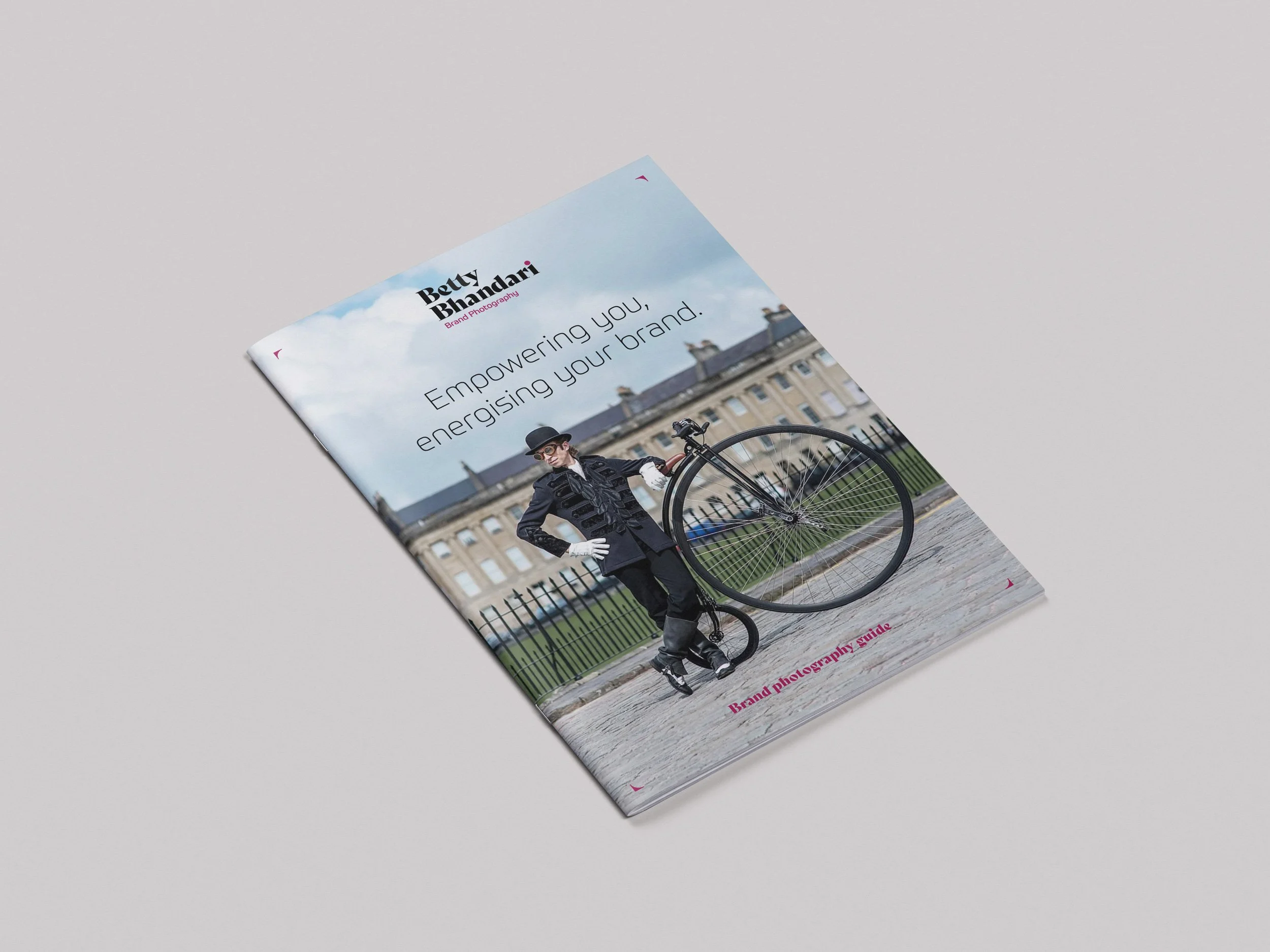
As a photographer who runs two businesses, Betty was looking to add some creative flair and consistency to her branding. The creative direction was to bring the two brands together as siblings which helped Betty when working on any promotional or client communication. We agreed the logo needed to be clean and simple avoiding any obvious links to cameras. The corners that frame the logo are a nod to the composition and framing of her photographs. They are flexible and can be use to frame other content when not used on the logo which has a version with the frame. The type used in the logo was chosen for its unique style, which is both detailed and bold. It works extremely well with large typography using one or two words as focal points.
As always when creating a new brand identity, we created a brand book, which included a new colour pallet for each business with similar tones for each that support the primary brand colours. As well as the logo typeface, we chose a supporting typeface for longer wording in a choice of weights which contrast nicely with the bold brand type.
It was important to understand each brand sibling and what it offers clients, so we dedicating time to create positioning copy for both weddings and brand photography. It was extremely helpful in the creative process to work on the messaging before designing any brand elements including the logo.
We created a set of branded icons in both brand colours which were another useful asset for the brand toolkit we would supply to the client. The simple line style complements the logo and replicates the clean brand style followed throughout. Icons are a great addition to help visualise services offered to clients.
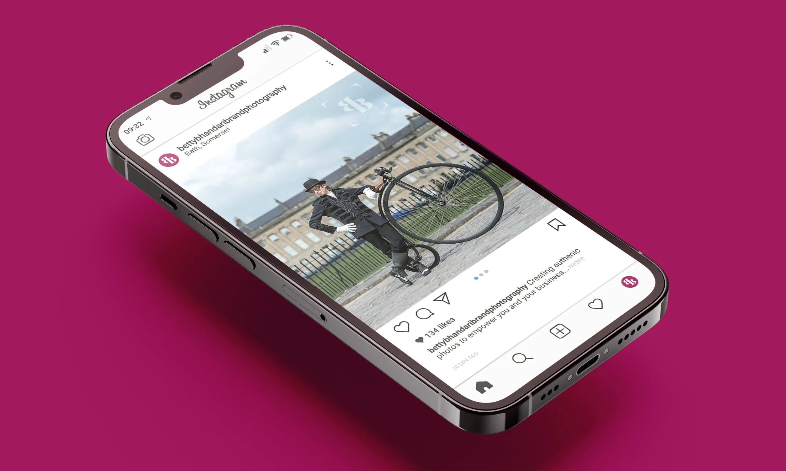
Social media was an area the client needed branded templates, so social posts could be easily created in less time. Consistency was key as it is to all brands so having a set of branded assets including a social brand symbol was important. Setting these up was simplified with both brands following the same approach differing by colour, messaging and photography.
Betty wanted to offer advice, tips and other ways for potential clients to engage over social platforms. We created a carousel design for her to adapt and populate for either brand. The designs were replicated in Canva, along with the brand assets, fonts and colours, making it easy for her to create and edit these posts, whilst retaining the brand style.